Expected and O/E calculations
The following steps assume that you ran the fanc auto command in Example analysis.
Additionally, we set up the Python session like this:
import fanc
import matplotlib.pyplot as plt
import fanc.plotting as fancplot

hic_500kb = fanc.load("output/hic/binned/fanc_example_500kb.hic")
If you want to try the tutorial with an equivalent Cooler file, load the Hi-C file like this instead:
hic_500kb = fanc.load("architecture/other-hic/fanc_example.mcool@500kb")
or like this if you want to work with a Juicer file built from the same data:
hic_500kb = fanc.load("architecture/other-hic/fanc_example.juicer.hic@500kb")
Note that there may be minor differences in the results due to the “zooming” and balancing applied by the different tools.
RegionMatrixContainer objects (see here) have a builtin
function to calculate expected values from existing matrix data called
expected_values(). This function calculates and returns
intra-chromosomal, intra-chromosomal per chromosome, and inter-chromosomal expected values.
intra_expected, intra_expected_chromosome, inter_expected = hic_500kb.expected_values()
Here, intra_expected is a list of average (/expected) contact values, where the position of
the value in the list corresponds to the separation between genomic regions in bins.
intra_expected_chromosome is a dictionary with chromosome names as keys, and an expected
value list as value calculated on a per-chromosome basis. inter_expected is a single, average
inter-chromosomal contact value.
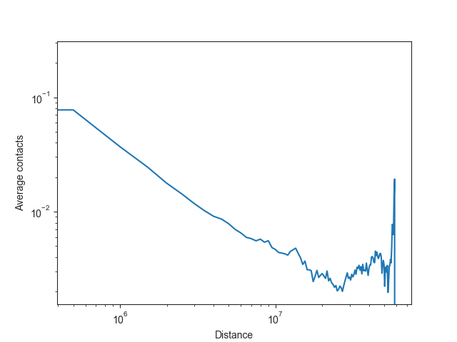
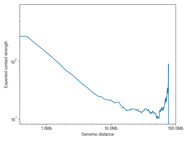
The expected values are typically plotted on a log-log scale, as illustrated here using chromosome 19:
# obtain bin distances
bin_size = hic_500kb.bin_size
distance = list(range(0, bin_size * len(intra_expected_chromosome['chr19']), bin_size))

# plot expected values
fig, ax = plt.subplots()
plt.plot(distance, intra_expected_chromosome['chr19'])
ax.set_xscale('log')
ax.set_yscale('log')
ax.set_xlabel("Distance")
ax.set_ylabel("Average contacts")
plt.show()
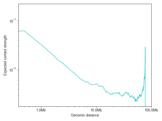
FAN-C also has a built-in function for plotting the expected values,
distance_decay_plot(). Additional named arguments
are passed on to ax.plot, for example to change the line color.
The function returns a matplotlib axes object, which can then be further customised:
ax = fancplot.distance_decay_plot(hic_500kb, chromosome='chr18', color='mediumturquoise')
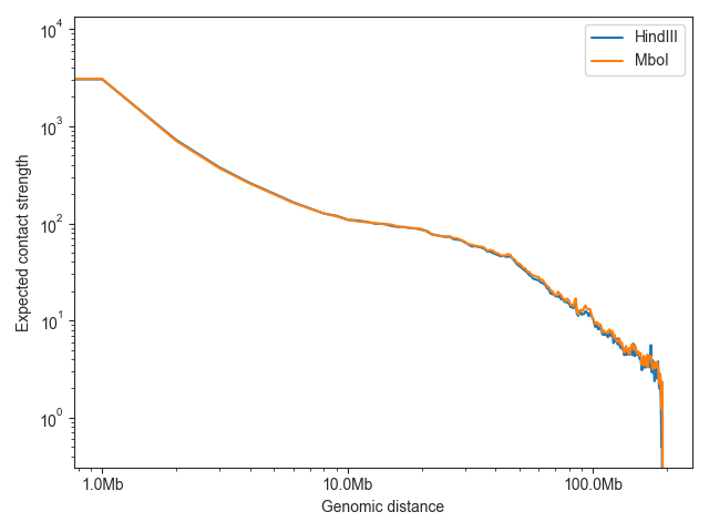
To compare the expected values of multiple samples, just provide multiple Hic objects:
lowc_hindiii = fanc.load("architecture/other-hic-update/lowc_hindiii_100k_1mb.hic")
lowc_mboi = fanc.load("architecture/other-hic-update/lowc_mboi_100k_1mb.hic")
ax = fancplot.distance_decay_plot(lowc_hindiii, lowc_mboi, chromosome='chr1',
                                  labels=['HindIII', 'MboI'])
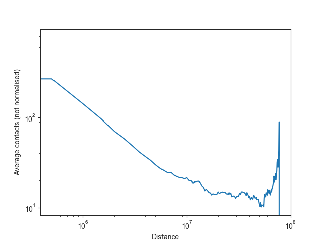
Note: as Hi-C matrices are normalised on a per-chromosome basis in FAN-C by default, it would be misleading to plot the overall normalised intra-chromosomal expected values, or to use them for downstream analysis. We can, however, also calculate the unnormalised expected values easily enough.
intra_expected_nonorm, intra_expected_chromosome_nonorm, inter_expected_nonorm = hic_500kb.expected_values(norm=False)

# obtain bin distances
bin_size = hic_500kb.bin_size
distance = list(range(0, bin_size * len(intra_expected_nonorm), bin_size))

# plot expected values
fig, ax = plt.subplots()
plt.plot(distance, intra_expected_nonorm)
ax.set_xscale('log')
ax.set_yscale('log')
ax.set_xlabel("Distance")
ax.set_ylabel("Average contacts (not normalised)")
plt.show()
If you are simply interested in plotting the unnormalised values, you can use
ax = fancplot.distance_decay_plot(hic_500kb, norm=False)
Expected values rarely need to be calculated explicitly in FAN-C analysis functions, but will be calculated (or retrieved) on demand whenever necessary. To obtain observed/expected matrices, for example, please refer to RegionMatrixContainer.