AB compartments
The following steps assume that you ran the fanc auto command in Example analysis.
Additionally, we set up the Python session like this:
import fanc
import fanc.plotting as fancplot
import matplotlib.pyplot as plt

hic_1mb = fanc.load("output/hic/binned/fanc_example_1mb.hic")
If you want to try the tutorial with an equivalent Cooler file, load the Hi-C file like this instead:
hic_1mb = fanc.load("architecture/other-hic/fanc_example.mcool@1mb")
or like this if you want to work with a Juicer file built from the same data:
hic_1mb = fanc.load("architecture/other-hic/fanc_example.juicer.hic@1mb")
Note that there may be minor differences in the results due to the “zooming” and balancing applied by the different tools.
AB correlation matrices can very easily be obtained from Hi-C files using the
from_hic() function:
ab = fanc.ABCompartmentMatrix.from_hic(hic_1mb)
The ab object acts like any FAN-C matrix (see RegionMatrixContainer), which means you
can query and subset the data any way you like. For example, to get the correlation matrix
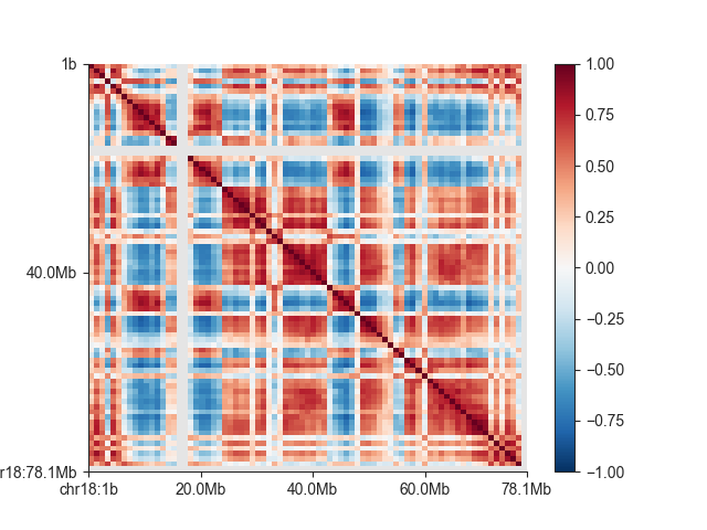
of chromosome 18:
ab_chr18 = ab.matrix(('chr18', 'chr18'))
And to visualise the matrix:
fig, ax = plt.subplots()
mp = fancplot.SquareMatrixPlot(ab, ax=ax,
                           norm='lin', colormap='RdBu_r',
                           vmin=-1, vmax=1,
                           draw_minor_ticks=False)
mp.plot('chr18')
plt.show()
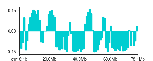
Eigenvectors
The AB correlation matrix eigenvector (EV) is used to determine if a region is in the active (A) or the inactive (B) compartment. It’s calculation is very straightforward:
ev = ab.eigenvector()
eigenvector() returns a numpy
array with one entry per region in the AB correlation matrix (you can retrieve a matching
list of regions with regions()).
You can also retrieve only the EV entries for a specific region using the sub_region
argument, but note that the calculation is always performed on the entire genome first
to avoid biases from subsetting.
Warning
Positive EV entries do not automatically mean a region is in the A compartment. In fact, if positive or negative entries are representing the A compartment is dependent on the implementation of PCA on the platform you are using. Therefore we strongly recommend using additional biological information to determine the correspondence between EV entry sign and compartment.
One option implemented in FAN-C is to use GC content as a proxy for activity, as GC-rich regions have been shown to be associated with the active compartment. FAN-C implements the use of a genomic FASTA file, to calculate GC content and then choose the EV sign so that positive entries correspond to A, and negative entries to the B compartment.
gc_ev = ab.eigenvector(genome='hg19_chr18_19.fa', force=True)
To plot the EV, you can use LinePlot:
fig, ax = plt.subplots(figsize=(5, 2))
lp = fancplot.LinePlot(ab, colors=['darkturquoise'])
lp.plot('chr18')
plt.show()
Enrichment profiles (Saddle plot)
An enrichment profile, which is used to create a saddle_plot() is used
to show how “interactive” genomic regions belonging to the A or B compartment are. To
calculate the enrichment profile, first all genomic regions are divided into bins, according
to their EV value (the “compartment strength”). Then, we use the O/E matrix the average O/E
value between all region bins, and take the log2 of the result. Everything is summarised in
a matrix, where rows and columns correspond to the genomic region bins, and matrix entries
reflect the bins’ interactivity. Positive values reflect more than expected contacts, while
negative values reflect less than expected contacts.
In FAN-C, you can use the enrichment_profile()
function for this purpose:
profile, cutoffs = ab.enrichment_profile(hic_1mb, genome='hg19_chr18_19.fa')
enrichment_profile() also returns
the EV cutoffs calculated from the percentiles argument. To get a higher resolution
of the enrichment matrix, use more finely-grained percentiles.
You can use the saddle_plot() function to plot the results:
fig, axes = fancplot.saddle_plot(profile, cutoffs)
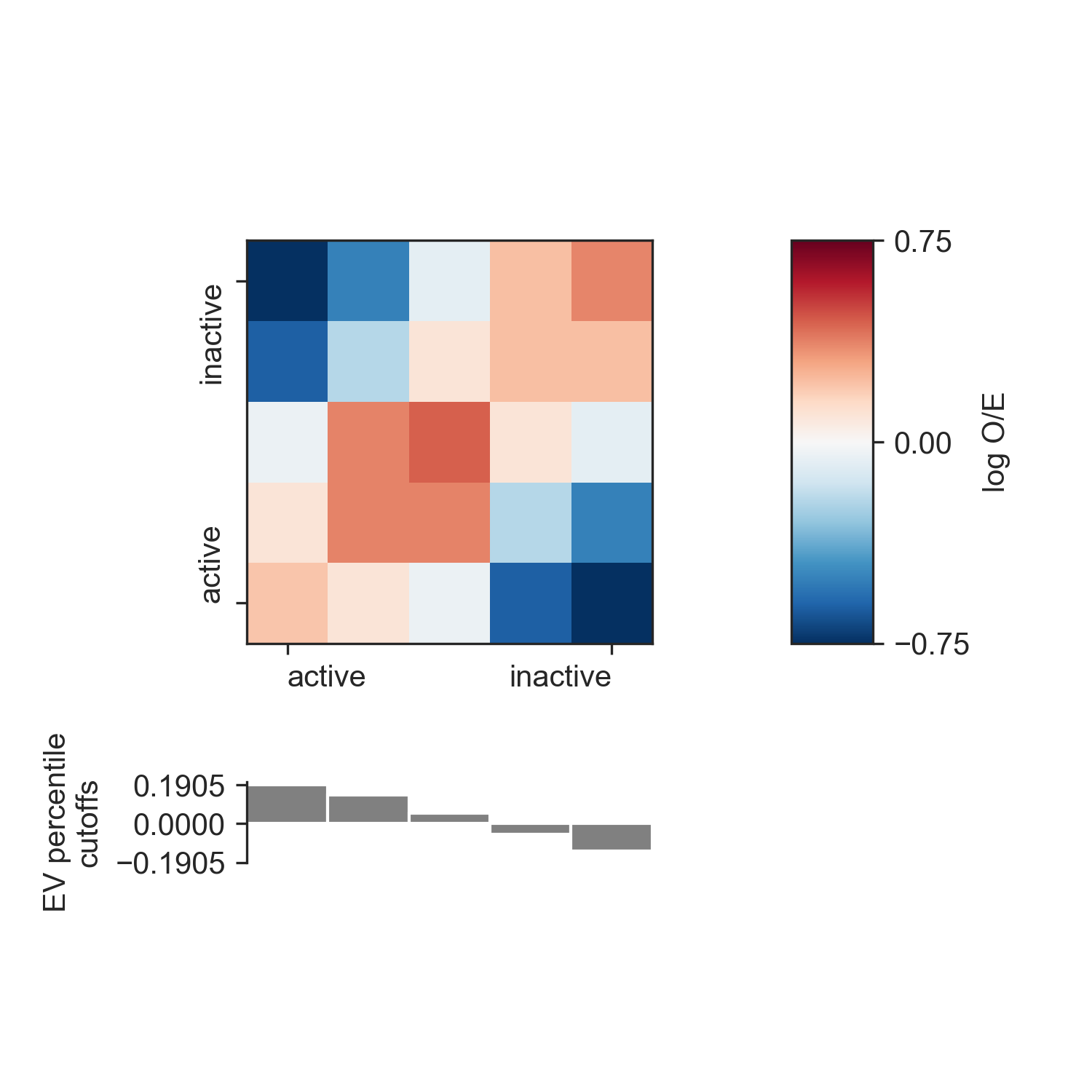
Since the layout of the matrix and the cutoffs barplot is somewhat complex, the function
generates its own figure and axes, which for the return values. You can, however,
specify your own axes using the axes parameter. You need to supply three axes:
one for the matrix, one for the barplot, and one for the colorbar. This allows you to
integrate the saddle plot into more complex figures. If you supply None as any
of the axes, the corresponding plot will not be generated.