Region and score plots
In addition to matrix-based plots, FAN-C provides a number of plots to plot genomic tracks alongside Hi-C data (although they can certainly also be used independently). The main plots in this category are
LinePlot, which plots (ideally continuous) scores associated with genomic regions as a line plot.BarPlot, which plots genomic region scores as barsGenomicVectorArrayPlot, which plots multiple scores associated with the same regions, such as insulation scores at different window sizes, as a heatmapFeatureLayerPlot, which plots the location of features as blocks, grouped by user-specified attributes, such as the location TAD boundaries in different matricesGenePlot, which, as the name suggests, can plot gene and transcript annotations, including exon-intron structures.
Line plot
LinePlot accepts a RegionBased object as input.
These can be created very easily from any compatible genomic regions format, including BED, GFF/GTF, BigWig,
Tabix, and more. So let’s load some BED files:
insulation_scores_1mb = fanc.load("architecture/domains/fanc_example_100kb.insulation_1mb.bed")
insulation_scores_2mb = fanc.load("architecture/domains/fanc_example_100kb.insulation_2mb.bed")
boundaries_1mb = fanc.load("architecture/domains/fanc_example_100kb.insulation_boundaries_1mb.bed")
boundaries_2mb = fanc.load("architecture/domains/fanc_example_100kb.insulation_boundaries_2mb.bed")
We can then use that directly as input:
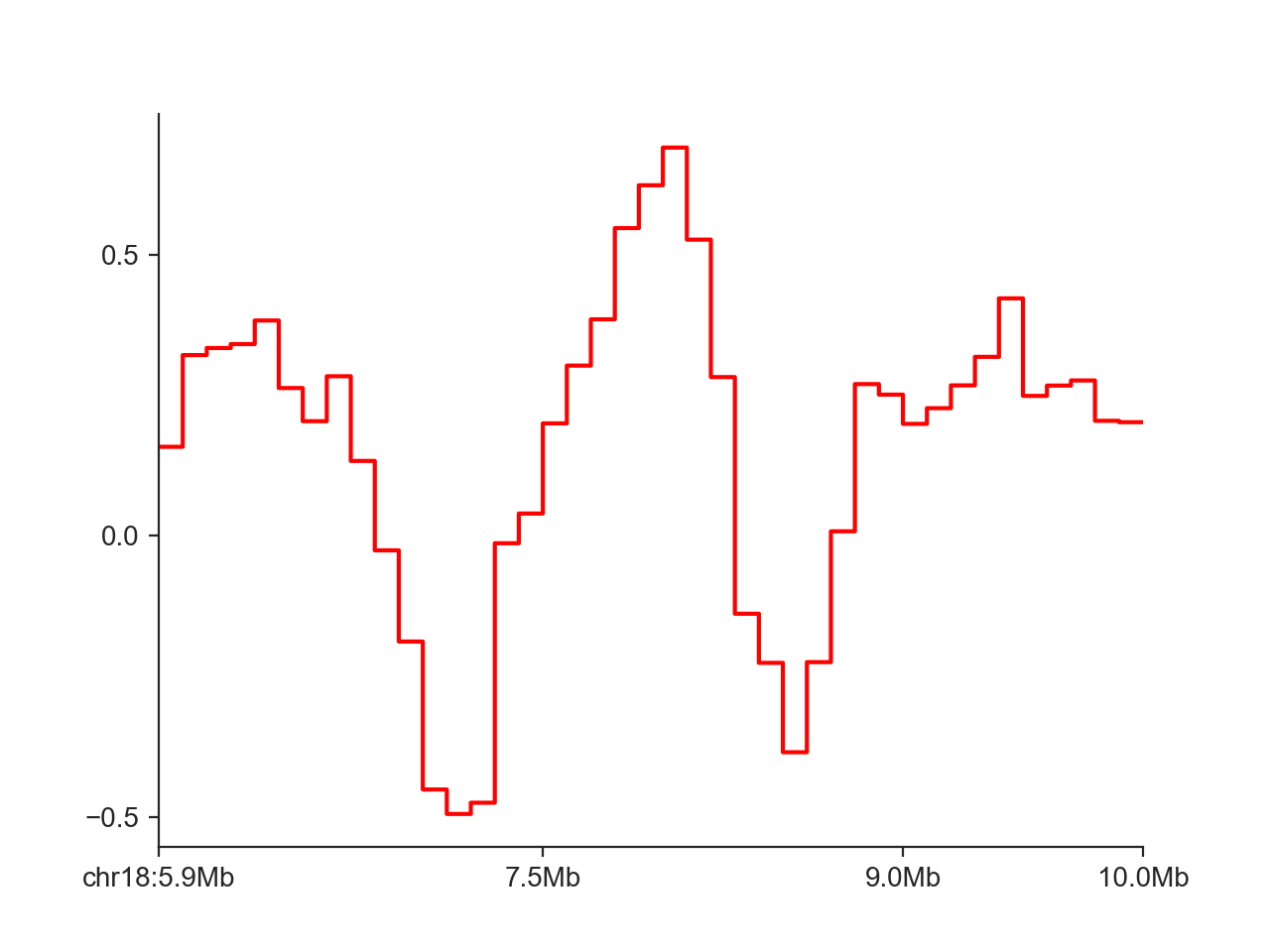
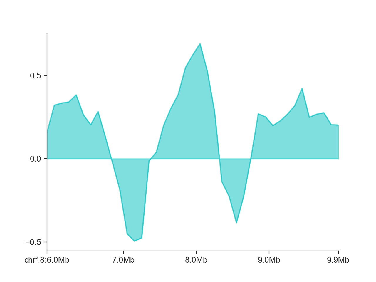
hp = fancplot.LinePlot(insulation_scores_1mb)
hp.plot('chr18:6mb-10mb')
hp.show()
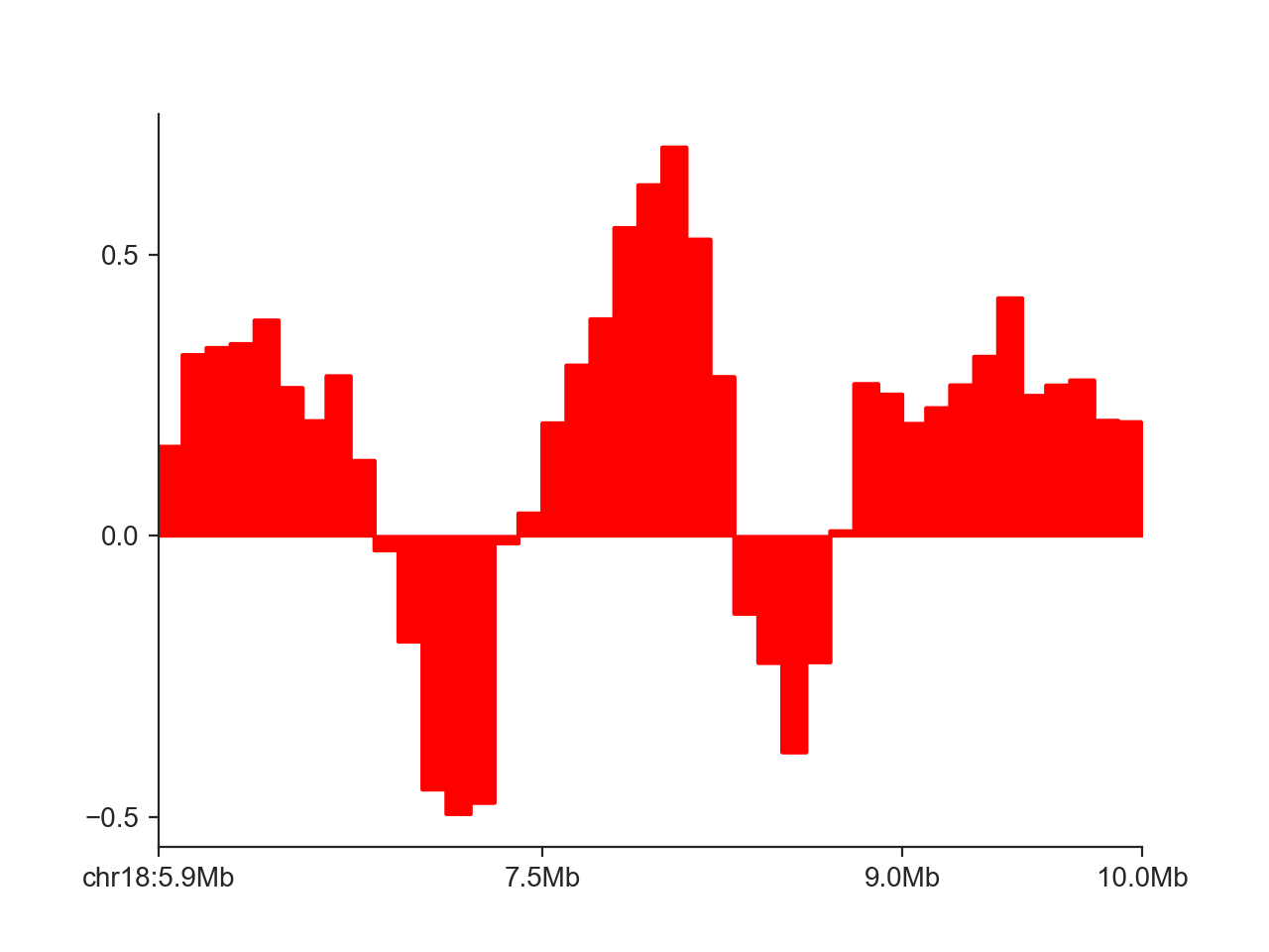
By default, FAN-C fills the area between the X axis and the curve. We can disable that using
fill=False:
hp = fancplot.LinePlot(insulation_scores_1mb, fill=False)
hp.plot('chr18:6mb-10mb')
hp.show()
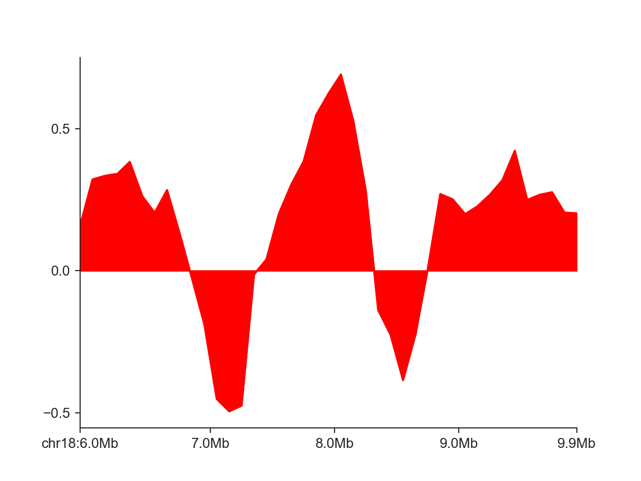
Instead of the step-wise style of the line, we can only connect points at each midpoint of the genomic regions:
hp = fancplot.LinePlot(insulation_scores_1mb, style='mid')
hp.plot('chr18:6mb-10mb')
hp.show()
We can change the color of the line with colors. Other plot aspects affecting the line drawing,
passed to the internal matplotlib ax.plot function, can be controlled through the plot_kwargs
dictionary, as shown here for transparency:
hp = fancplot.LinePlot(insulation_scores_1mb, style='mid', colors='cyan',
                       plot_kwargs={'alpha': 0.5})
hp.plot('chr18:6mb-10mb')
hp.show()
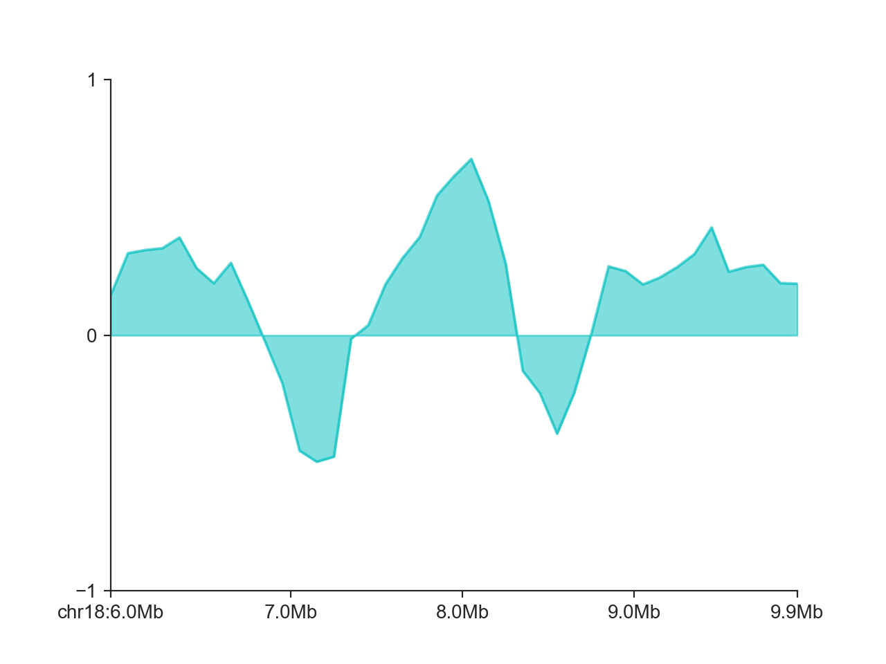
Finally, we can control the y axis limits with ylim (or you can use a custom axis.
hp = fancplot.LinePlot(insulation_scores_1mb, style='mid', colors='cyan',
                       plot_kwargs={'alpha': 0.5}, ylim=(-1, 1))
hp.plot('chr18:6mb-10mb')
hp.show()
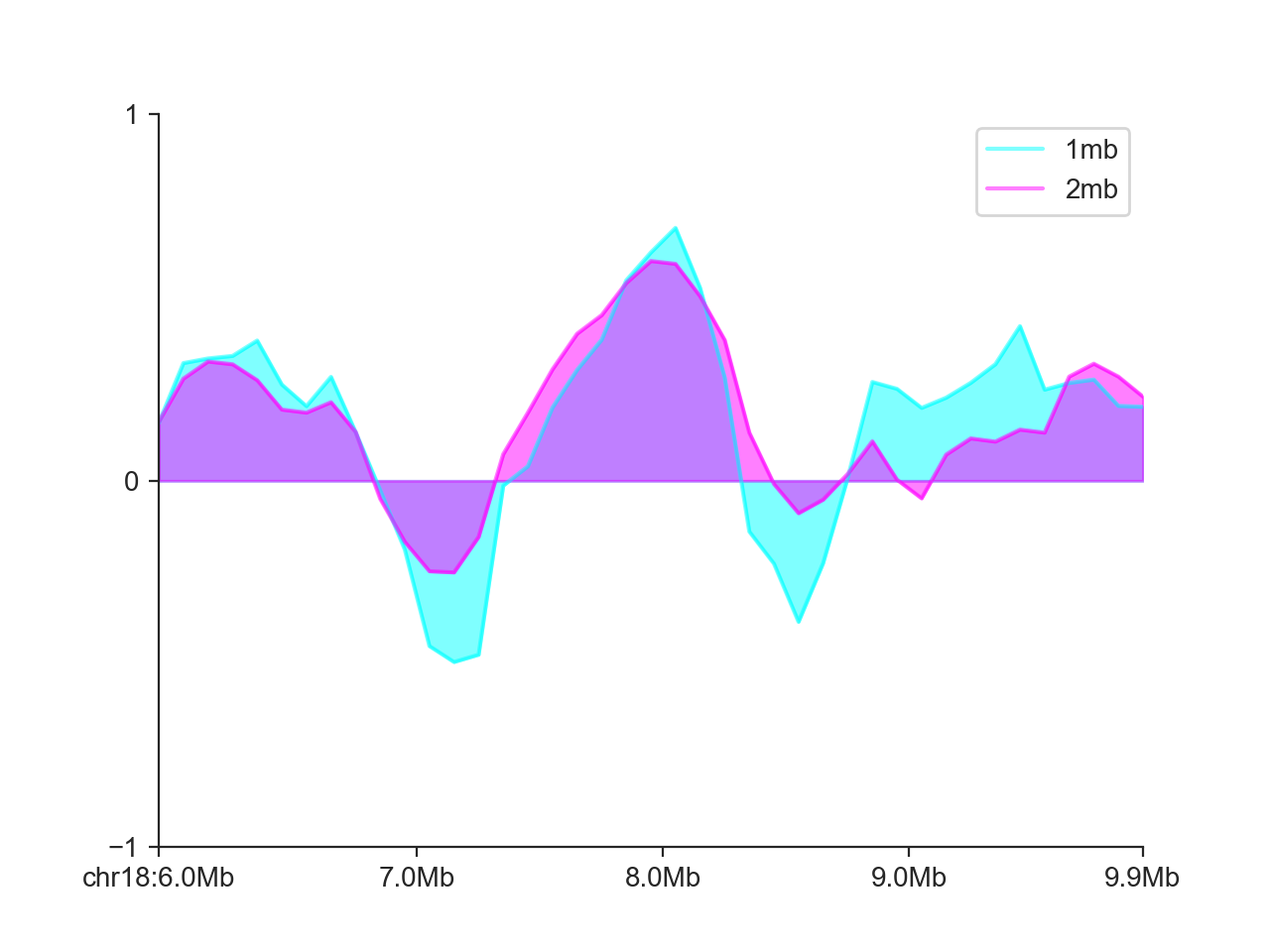
It is also possible to add multiple score tracks to the same LinePlot:
hp = fancplot.LinePlot((insulation_scores_1mb, insulation_scores_2mb),
                       style='mid', colors=('cyan', 'magenta'),
                       plot_kwargs={'alpha': 0.5}, ylim=(-1, 1),
                       labels=('1mb', '2mb'))
hp.plot('chr18:6mb-10mb')
hp.show()
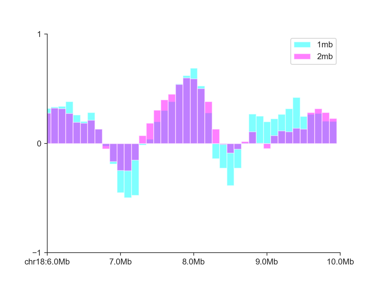
Bar plot
The BarPlot works in virtually the same way as the
LinePlot:
hp = fancplot.BarPlot((insulation_scores_1mb, insulation_scores_2mb),
                      colors=('cyan', 'magenta'),
                      plot_kwargs={'alpha': 0.5}, ylim=(-1, 1),
                      labels=('1mb', '2mb'))
hp.plot('chr18:6mb-10mb')
hp.show()
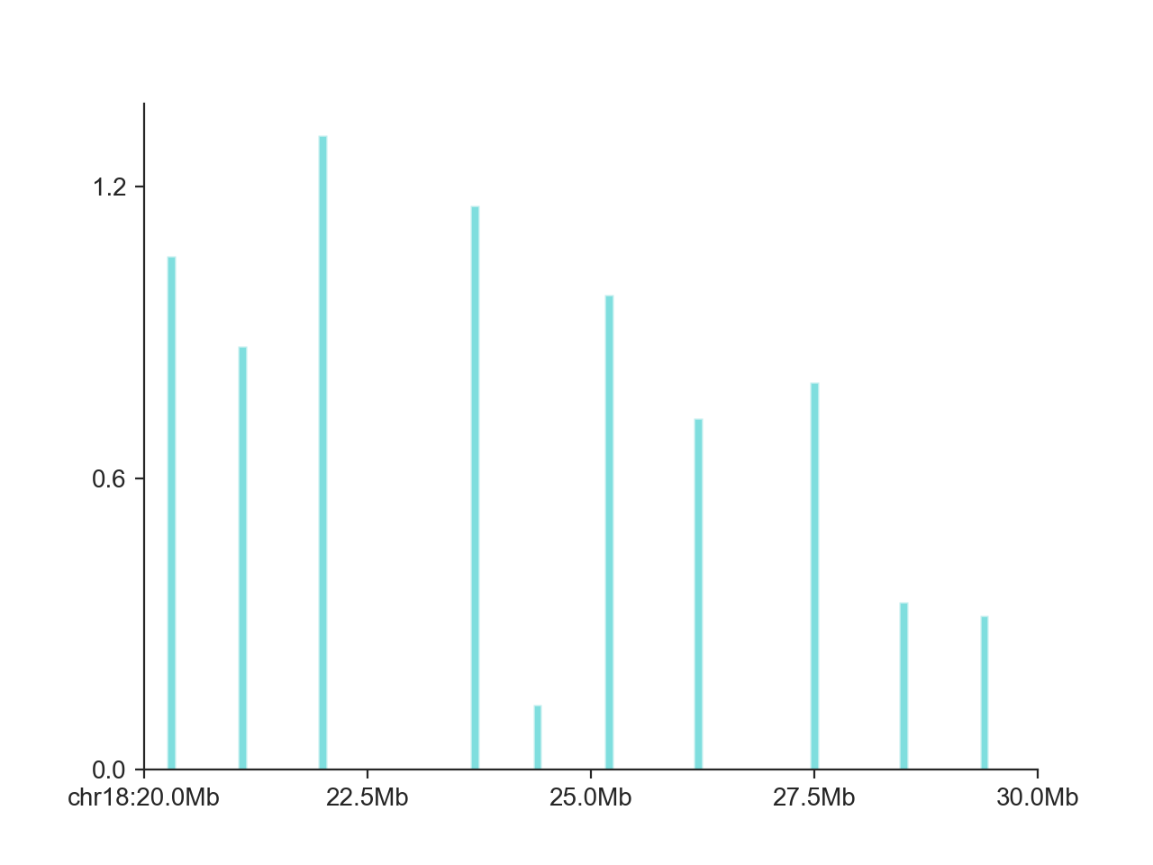
In addition, it also works very well for non-continuous data, such as shown here for domain boundaries in a larger interval:
hp = fancplot.BarPlot(boundaries_1mb, colors='cyan')
hp.plot('chr18:20mb-30mb')
hp.show()