Matrix plots
After importing fanc.plotting as fancplot, we have access to a range of Hi-C (and related)
matrix plots. We already used the TriangularHicPlot as an example in
Plotting API basics. In total there are four types of matrix visualisation built in to FAN-C:
SquareHicPlot, which shows a square matrix, with colors typically representing contact strength between the two genomic regions on the X, and Y axes, respectively.TriangularHicPlot, which rotates the matrix by 45 degrees, so instead of a square, it now becomes a triangle. This can be particularly useful if features close to the matrix diagonal, such as TADs, are of interest, and if additional genomic tracks, such as CTCF binding, should be shown underneathSplitMatrixPlot, which is similar to theSquareHicPlot, but the values above and below the diagonal are from different matrices. This is a great way for direct matrix feature comparisons in the same plot.MirrorMatrixPlot, which can be used to show two matrix plots, particularly of the typeTriangularHicPlot, mirrored at the X axis
All of these are built on the base class BasePlotterMatrix, so
they share of lot of options and functionality. Let’s look at each of them in turn.
Square matrix
To generate a basic square matrix plot, run
hp = fancplot.SquareMatrixPlot(hic)
hp.plot('chr18:6mb-10mb')
hp.show()
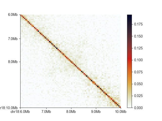
Currently, the diagonal is about the only thing visible in this example, so let’s adjust the saturation
of the plot with vmax (vmin can be used to set a lower bound)
To generate a basic square matrix plot, run
hp = fancplot.SquareMatrixPlot(hic, vmax=0.05)
hp.plot('chr18:6mb-10mb')
hp.show()
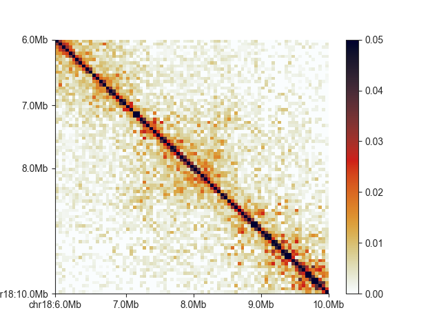
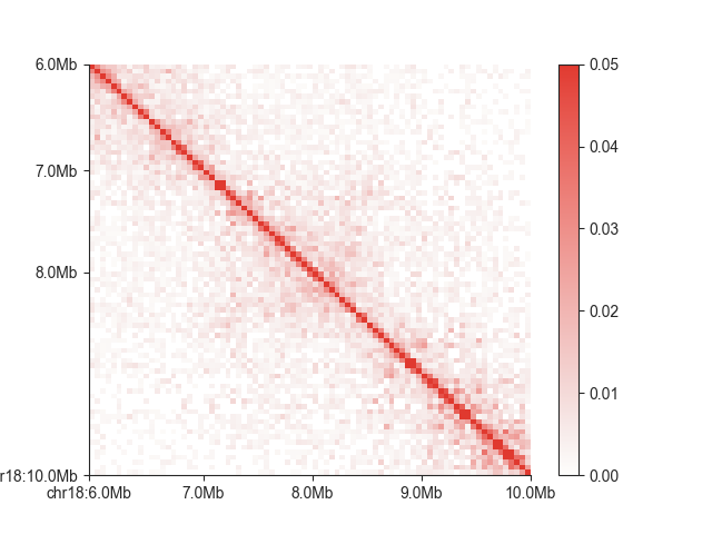
FAN-C uses the custom “germany” colormap as a default, built using the colormap scripts from Stéfan van der Walt and Nathaniel Smith, which have also been used to generate the default matplotlib colormaps. It is “perceptually uniform”, and thus well-suited to represent contact intensities. We are also including a colormap called “white_red”, for a more classic Hi-C matrix look, but equally perceptually uniform:
hp = fancplot.SquareMatrixPlot(hic, vmax=0.05, colormap='white_red')
hp.plot('chr18:6mb-10mb')
hp.show()
Any Matplotlib-compatible colormap
can be used to change the look of your matrix. You can remove the colorbar, for example if you want to
add your own on a different axis, using show_colorbar=False. Alternatively, if you have set up your
axes manually, you can move the colorbar to an axis of your choice using
cax=<your axis> in the constructor.
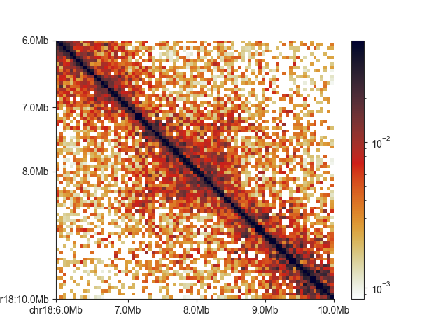
The exponential decay of contact intensities with distance between any two loci can sometimes make it difficult to visualise features close to the diagonal and far fro it simultaneously. Sometimes showing colors on a log scale can improve this:
hp = fancplot.SquareMatrixPlot(hic, vmax=0.05, norm='log')
hp.plot('chr18:6mb-10mb')
hp.show()
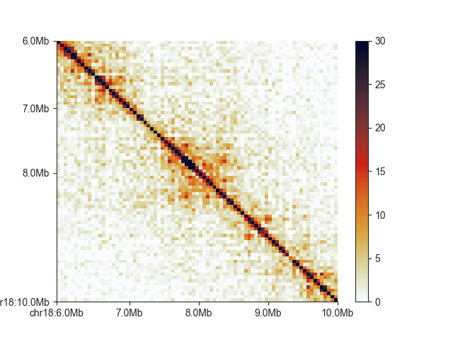
You can show uncorrected values using matrix_norm=False (note the color scale change):
hp = fancplot.SquareMatrixPlot(hic, vmax=30, matrix_norm=False)
hp.plot('chr18:6mb-10mb')
hp.show()
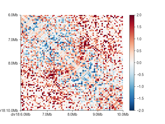
We can also show log2 observed/expected values using oe=True and log=True When not setting the
colorbar limit explicitly, you can also make the colorbar symmetrical around 0 using colorbar_symmetry=0.
We will also use a divergent colormap:
hp = fancplot.SquareMatrixPlot(hic, vmin=-2, vmax=2, oe=True, log=True,
                               colormap='RdBu_r')
hp.plot('chr18:6mb-10mb')
hp.show()
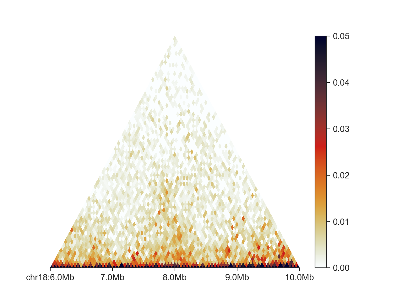
Triangular matrix
Any of the above customisations also work for the triangular version of the matrix plot,
TriangularHicPlot.
hp = fancplot.TriangularMatrixPlot(hic, vmax=0.05)
hp.plot('chr18:6mb-10mb')
hp.show()
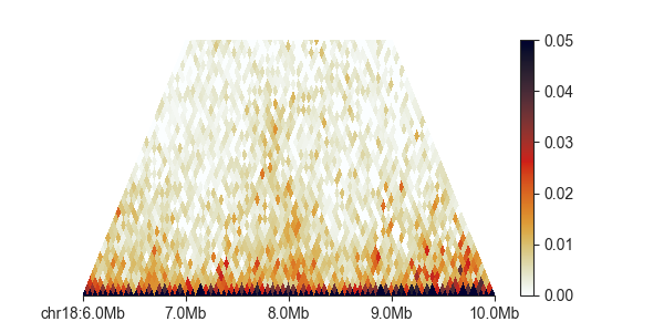
Additionally, we can control the height, at which the triangle is cut off, and therefore
the maximum distance at which contacts are shown between two regions, with max_dist.
This value is expressed in base pairs, but supports strings in genomic format:
hp = fancplot.TriangularMatrixPlot(hic, vmax=0.05, max_dist='2mb')
hp.plot('chr18:6mb-10mb')
hp.show()
Split matrix
The SplitMatrixPlot requires two Hi-C objects, one for
above, and one for below the diagonal. Unless you explicitly set scale_matrices to False,
the plot will first scale both matrices to the same sequencing depth, in order to make them
more comparable. Depending on your normalisation, this may not be necessary.
Mirrored plot
To showcase the MirrorMatrixPlot, we can plot the Hi-C matrix,
and its O/E transformation at the same time:
# first create two triangular plots
top_plot = fancplot.TriangularMatrixPlot(hic, vmax=0.05, max_dist='2mb')
bottom_plot = fancplot.TriangularMatrixPlot(hic, vmin=-2, vmax=2, oe=True, log=True, colormap='RdBu_r', max_dist='2mb')
# then merge them
hp = fancplot.MirrorMatrixPlot(top_plot, bottom_plot)
hp.plot('chr18:6mb-10mb')
hp.show()
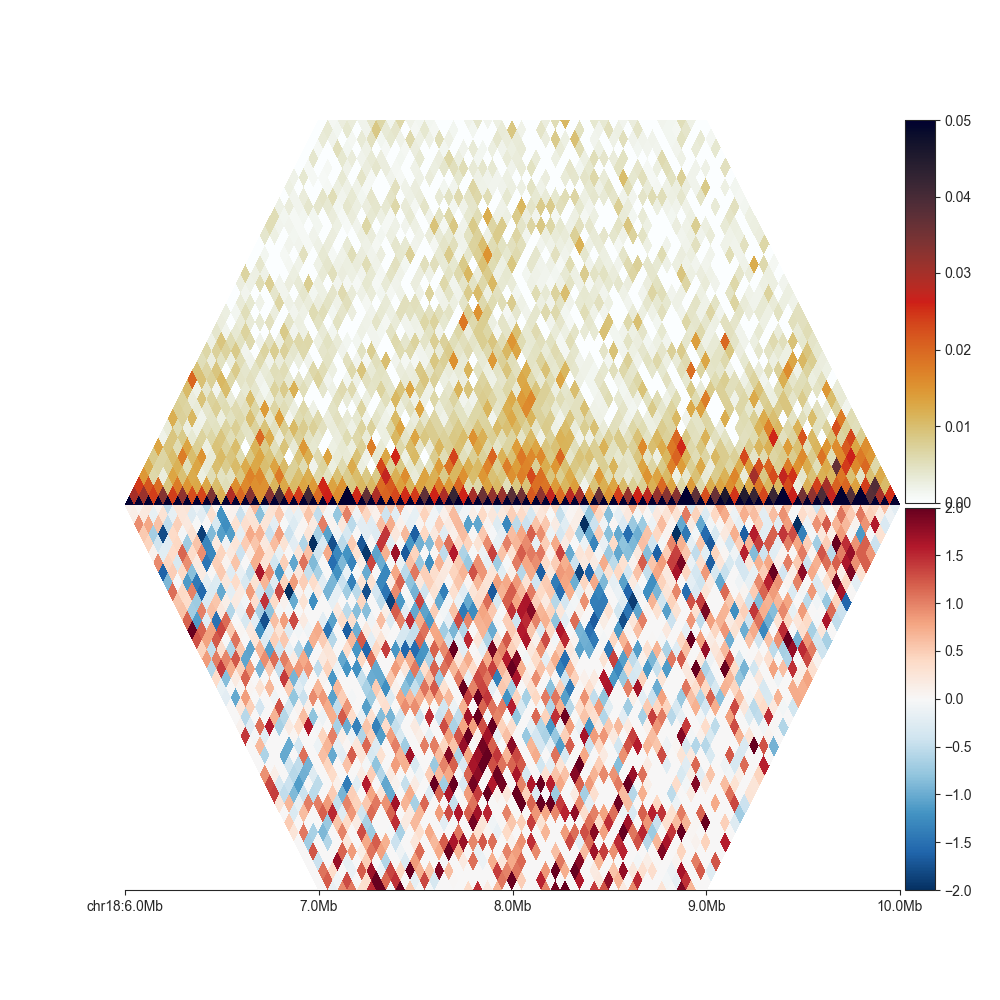
Opposed to Split matrix, it is also possible to combine matrices of different resolution, or from different Hi-C experiments, as long as they are from the same organism.