Plotting API basics
FAN-C plotting functions are imported in a Python script or console using
import fanc
import fanc.plotting as fancplot
This will provide access to the FAN-C plot types and custom colormaps for matrix visualisation.
For the following sections we will load a Hic file for plotting:
hic = fanc.load("output/hic/binned/fanc_example_50kb.hic")
BasePlotter
Each plot type is based on the BasePlotter class.
It controls the formatting of the X axis in genomic coordinates (kb, mb, etc), and provides
a plot() function, common to all FAN-C plot types,
which accepts genomic interval definitions in the form of strings (chr18:6mb-8mb) or
GenomicRegion objects.
As an example of basic functionality, we will be looking at the TriangularMatrixPlot:
hp = fancplot.TriangularMatrixPlot(hic, vmax=0.05)
hp.plot('chr18:6mb-10mb')
hp.show()
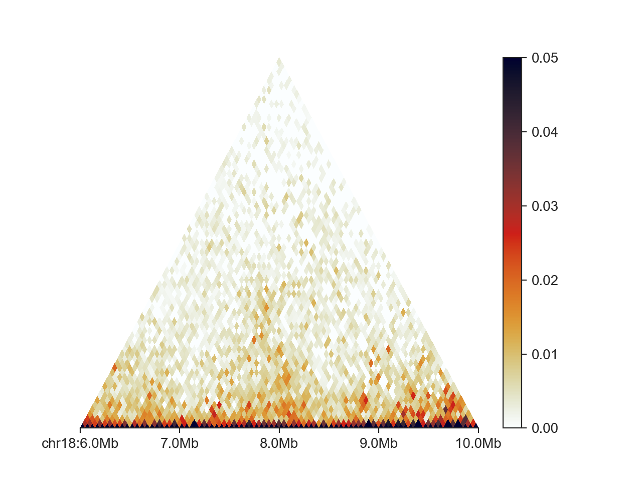
The first line sets up the triangular matrix plot parameters. Except for vmax we have kept the defaults.
The second line is where the actual plotting to a genomic region happens and the plot components are
assembled. The final line simply opens an interactive plotting window.
To save the plot to file, you can use hp.save('/path/to/file.png').
You can control the formatting of the X axis using a number of different parameters.
draw_ticks can be set to False to remove the major (and minor) tick marks at
major genomic locations. draw_major_ticks and draw_minor_ticks control the drawing of
major and minor ticks, respectively, in the same manner. draw_minor_ticks is False
by default. To display a small legend in the bottom right of the plot that shows the
distance between major ticks, between minor ticks, and the entire plotting range, set
draw_tick_legend to True. You can remove the chromosome label at the first location by
setting draw_chromosome_label to False. You can invert the X axis (and the plot)
by setting invert_x to True, or remove the X axis entirely by setting draw_x_axis
to False.
Using dedicated Matplotlib Axes
For the highest level of control over your plot, you can build your figures on top of Matplotlib. This enables you to modify each aspect of the plot after it has been generated. To start, import matplotlib:
import matplotlib.pyplot as plt
And use the ax argument of the FAN-C plot to supply it with a custom axis.
fig, ax = plt.subplots()
hp = fancplot.TriangularMatrixPlot(hic, vmax=0.05, ax=ax)
hp.plot('chr18:6mb-10mb')
ax.set_xticks([7500000, 8500000])
ax.set_xticklabels(['customise', 'everything!'])
hp.show()
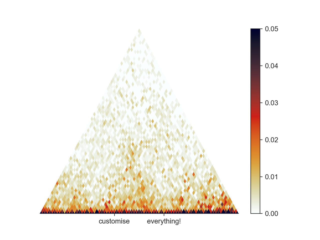
Matplotlib offers an incredible amount of customisation and plotting options, which are too numerous to cover here, but we encourage you to study the Matplotlib documentation for getting your plots to look perfect!